Graphic design is experiencing a renaissance. More than ever, we rely on its ability to express and contain ideas and messages that are encapsulated in branding of cities, corporations, and other socio-economical entities. Letterheads, billheads, logos and so on are the constituting parts of a fast communication by a specific brand. Whether one sends or receives a message, there's a demand for streamlined clarity, an economy of means.
In the past two centuries, designers have striven to reach the frontiers of efficient and perfect communication. They have been responding to the need for clarity and speed. They have employed all elements of design including; visuals, typefaces, compositions, and balance for communicating in the clearest, most efficient manner. The history of letterheads shows that excellence in design really does matter, and even today is not a quaint concept from the past.
The study of these letterheads reveals to us what difference does the composition the type make, and how does the position and placement of words on a surface and its relation to the illustration alter our perception, and in the final analysis, it shows what the designers hoped to accomplish by focusing attention on this aspect of creating identity, and how they tried at times to slow readers down and at other occasions tried the opposite, and why.
 |
Autograph Letter Signed, Chatham, R.I., July 30, 1860. Lincoln's election special letterhead engraved and published by E.
Meade, Chicago.
The letter discusses purchasing of sheep that are going to Orleans and a
ranch in Texas |
.
 |
| Henry Disston & Sons, Mid-19 century |
 |
Milton Bradley & Co. Publishers & Manufacturers of Games & Home Amusements, 1881
In this letter to Crane & Co. of Nov. 11, 1881, Bradley & co offers to create a brand identity for them:
“We should prefer to engrave you a neat business label, and make you a plain artistic design, something that you could use on all your various sizes and papers…and all your labels would look uniform by having the same border design and the same tint of paper.”
Bradley was born in Vienna, Maine, in 1836 and moved to Springfield, Massachusetts, at the age of 19. Trained as a draftsman, he started a creer with the Watson Car Manufacturing Co., drawing the plans for the company’s line of locomotives and railroad cars. But after seeing a color lithograph he decided to become a graphic designer, and in 1860, at the age of 24, he formed the Milton Bradley Company, possessing the only color lithograph machine in Massachusetts outside Boston.
|
 |
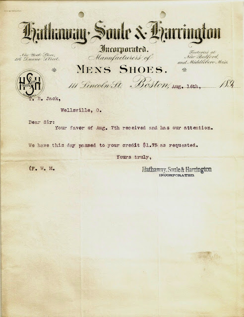
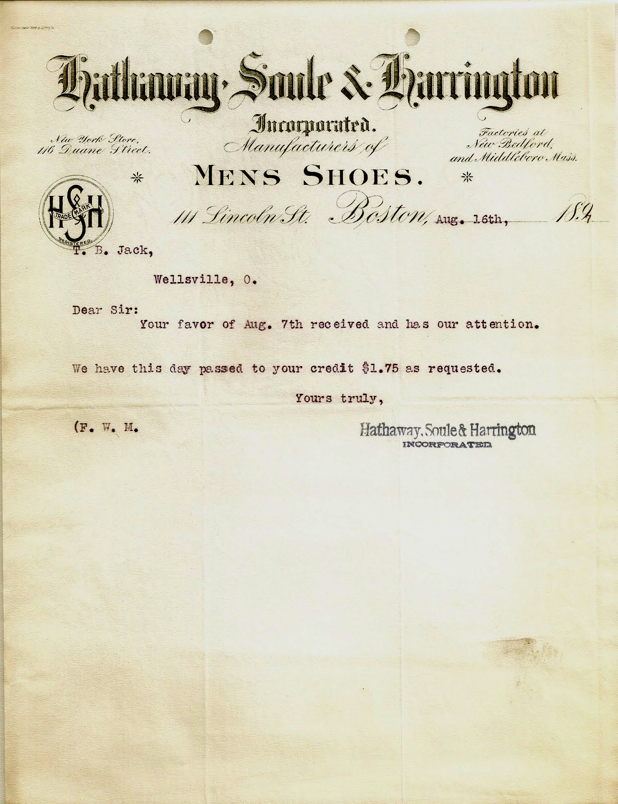
| Hathaway, Soule & Harrington envelope, 1882. |
 |
|
| Hathaway, Soule & Harrington envelope, 1897. |
|
 |
| J. Huber confectionery's letterhead, 1898. |
 |
Manly Manufacturing Company letterhead dated 1 March 1895
This shocking letter head featuring an image of stereotypical 19th-century African American caricature behind
bars represents the type of advertising that was very common beginning in the Victorian era. Caricatured
images of African Americans and other minorities were commonly used to sell products because they capitalized on existing beliefs and, ultimately, reinforced existing prejudices.
|
 |
| Sterling Remedy Co.,
letterhead,
Indiana Mineral Springs, Indiana, 1893, |
 |
| Thomas Stevenson, billhead , 1876 |
 |
| T. H. Briggs & Sons Hardware, billhead, 1881. |
 |
| W.C. & A.B. Stronach Grocers and Candy Manufacturers, billhead, 1880 |
 |
| Barnum & Bailey, Greatest Show on Earth, 1900
|
 |
| P. & F. Corbin, Printed by the Forbes Lithograph Mfg. Co., 1913 |
 |
| L. Adler, Bros. & Co., Printed by the Forbes Lithograph Mfg. Co., 1913 |
 |
| Dominion Press Clipping Agency, 1928 |
 |
Hermes, A.Baggenstos' leeterhead, 1930
August Baggenstos was general representative for Hermes typewriters in Zürich, Switzerland |
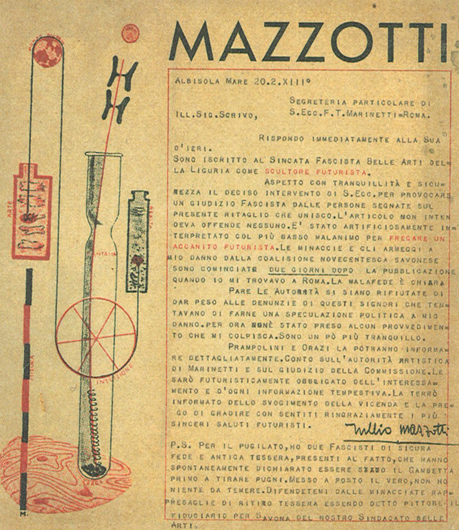 |
Bruno Munari, Mazzotti. Italy, 1934 |
 |
| FT Martinetti, drawing by Giacomo Ball, Movimento Futurista. Rome, 1939 |
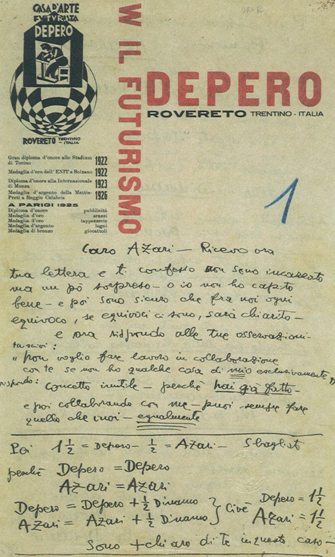 |
| Fortunato Depero, Depero. Italy (Trentino), c. 1927 (Collection Getty Center for the History of Art and the Humanities, Santa Monica) |
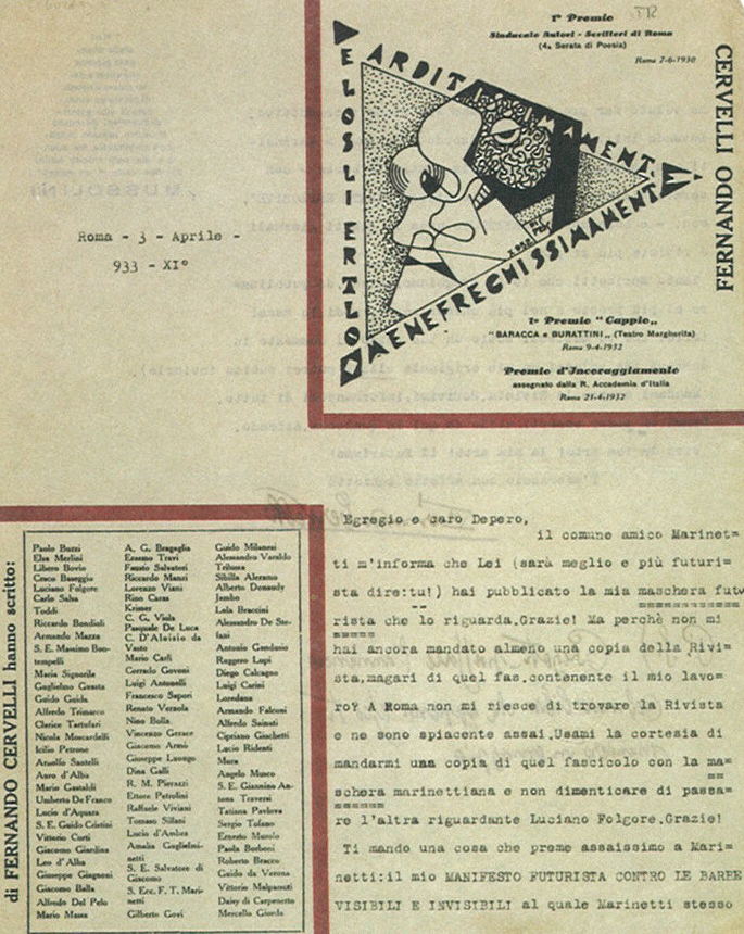 |
| Anonymous, Fernando Cervelli. Rome, 1932 (Collection Getty Center for the History of Arts and the Humanities, Santa Monica) |
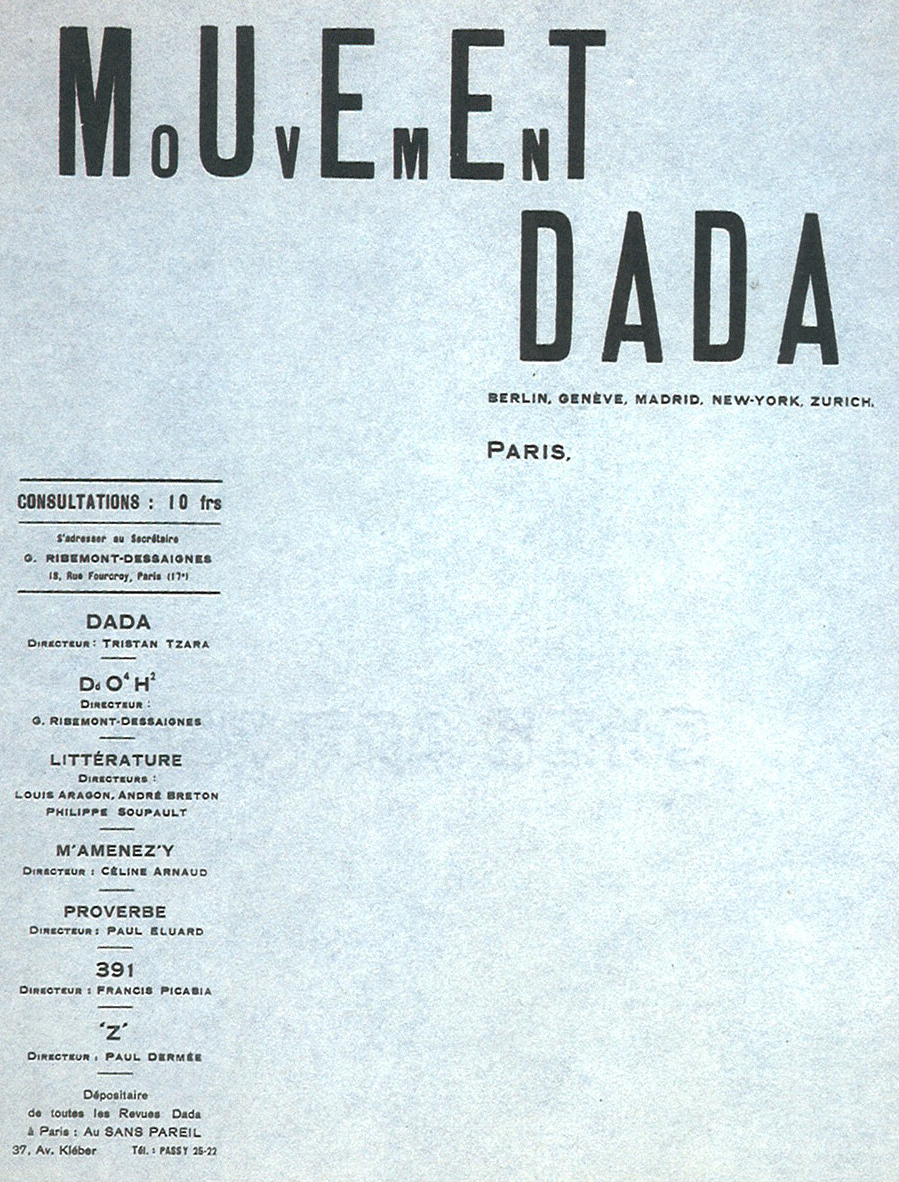 |
| Tristan Tzara, MoUvEmEnT DADA. Paris c. 1918 |
 |
| Johannes Baader and Raoul Hausmann, Club Dada postcard. Berlin, c. 1919 |
 |
Anonymous, Cause Le Surréalism (a Surrealist association). Paris, 1940s |
 |
| Benjamin Péret. Paris (Collection W Michael Sheehe, New York) |
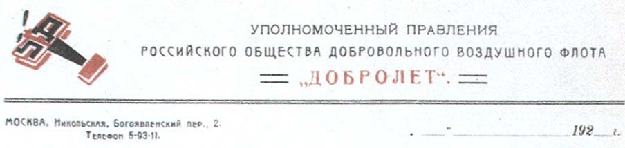 |
Alexander Rodchenko, Dobrolet State Merchant Air Service. Moscow, 1923 |
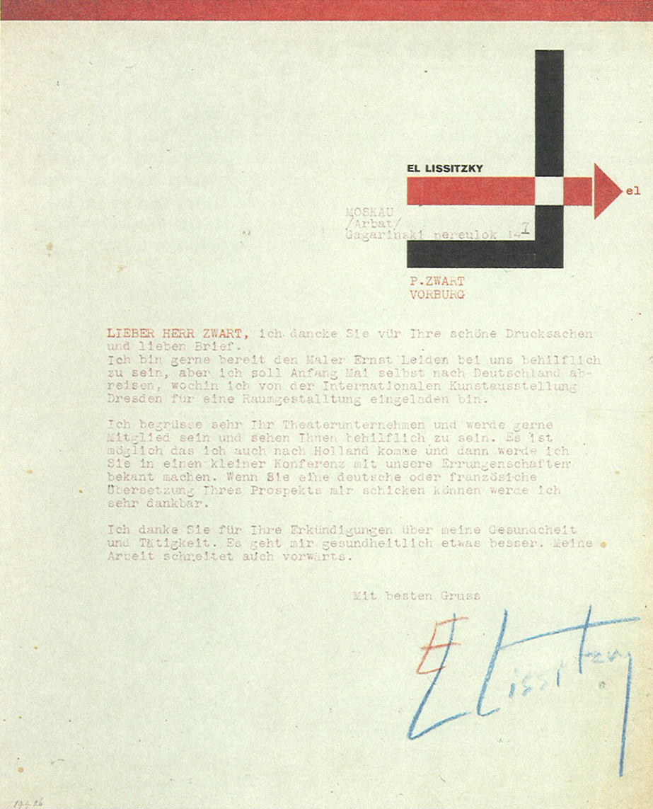 |
| El Lissitzky. Moscow, 1924 |
 |
| El Lissitzky, Vesc/Object/Gegenstand. Berlin, 1922 (from the collection of Hans Berndt, Germany) |
 |
| Theo Van Doesburg, De Stijl NB postcard. Netherlands (The Hague and Leiden), 1920 |
 |
| Josef Peeters, Het Overzicht postcard. Antwerp, 1923 |
 |
| Thon De Does, Reclame Ontwerper. Rotterdam, 1930 |
 |
| Piet Zwart, Wij Nu Experimenteel Tooneel. The Hague, 1925 |
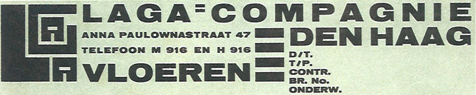 |
| Piet Zwart, Laga-Compangnie. The Hague, 1922 |
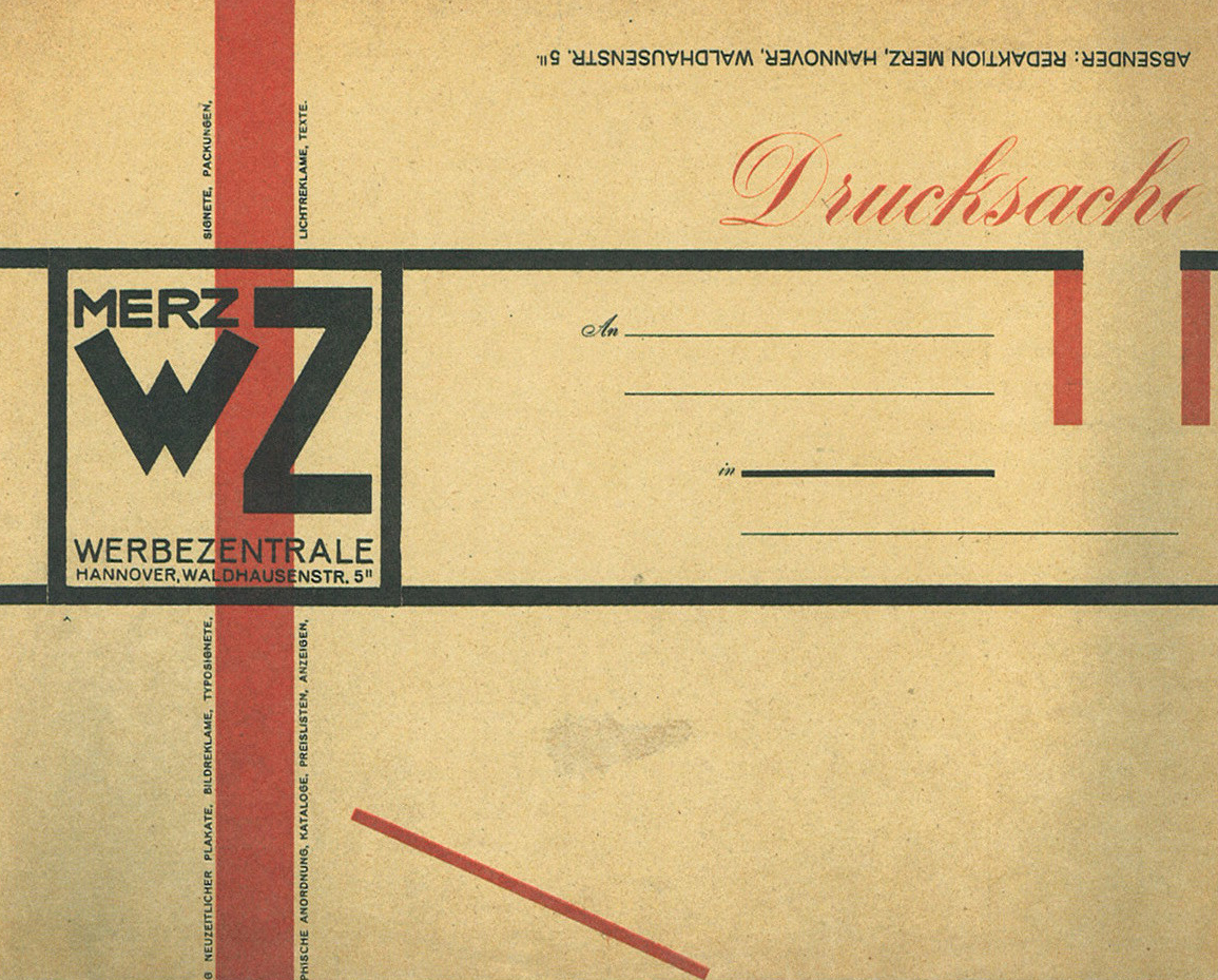 |
| Kurt Schwitters, Merz Werbezentrale envelope. Hanover, 1924 |
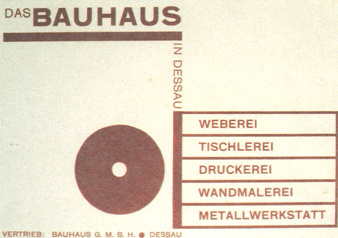 |
| Joost Schmidt, Das Bauhaus in Dessau postcard. Dessau, 1925-26 |
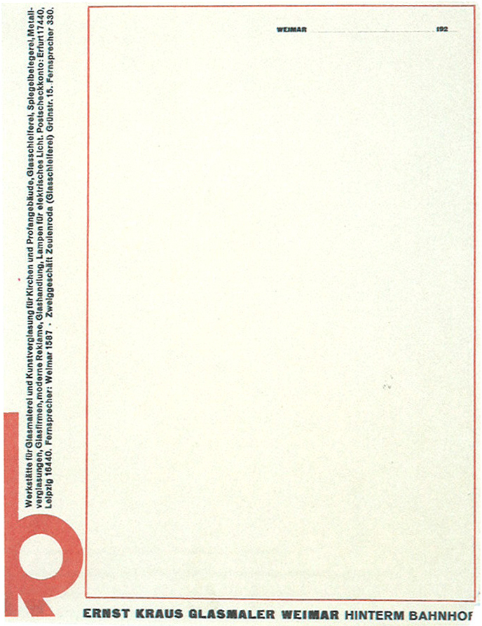 |
| Herbert Bayer, Ernst Kraus Glasmaler Weimar. Weimar, 1924 (Collection W Michael Sheehe, New York) |
 |
| E McKnight Kauffer, Lumium Limited. London, 1935 (Collection Cooper-Hewitt, Nat. Design Museum, Smithsonian Institution) |
 |
| Pepsi Cola, Company, Office of the President, letterhead, 1941 |
 |
| The Topical Advertising Service, 1948 |
 |
Andy Warhol, 242 lexington ave, New York, n y.,1953
In the summer of 1953 Warhol and his mother moved from their apartment on East 75th Street to a floor-through apartment in a four story building at 242 Lexington Avenue. According to Warhol biographers, Warhol subleased the apartment from another ex-classmate at Carnegie Tech., Leonard Kessler.
|
 |
| The doors, Jim Morrison's letterhead,1970 |
 |
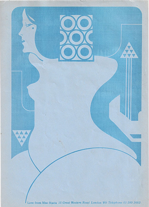
| Love from Miss Stacia, letterhead of Stacia, a dancer for the band Hawkwind, designed by Barney Bubbles, 1973 |
____________________________________________________________________________
This work is licensed under a Creative Commons Attribution-No Derivative Works 3.0 Unported License.


No comments:
Post a Comment