
The role of package design also known as brand packaging is of crucial importance in the marketing of a product. Packaging not only conveys information about the features of the product but also the vision of a brand.
Packaging is also used to manipulate the psychology of the buyer. All the elements of design, i.e., form, color, font, logo, and illustration are used in an increasingly competitive market to attract the attention of customers.
The main functions of packaging of course are to shield its content from mechanical damage and includes cushioning against the mechanical shock, vibration, electrostatic discharge, compression, temperature, and leakage, to provide instructions as how to assemble, transport, recycle, or dispose of the package or product, to provide ease of handling in storage, distribution, and recycling or disposal, and to protect from the contamination, oxidization, and radiation. These considerations can impose challenging limits on design, but good designers can overcome these constraints and transform them to their advantages.


A sophisticated, elegant and attention-grabbing look is the most essential feature for marketing of a product. However, it is not enough for a package design to just stand out clearly in the monotonous competitive environment, and to be just surprising among a bunch of competitive products cannot guarantee to create consumer loyalty. Truth and honesty in conveying the pertinent information are the essential factors for long term success. Only then one can expect a payoff for extra efforts in design of a package.
Aesthetics and elegance are major differentiating features for an outstanding package and beautiful packaging design in itself would be informative about the quality of a product. In today’s hegemony of mass production most consumers would be delighted to experience a little bit of art in the banality of everyday life! However, an agreeably decorated package design must work in tandem with the functionality of the product. Protection against contaminant, mechanical shocks, light and oxidization must be fully accommodated by design. Value Packaging is an excellent way to communicate sophistication, class and value.


The modern consumer packaging was born by an accident. In 1840 the hand-folded carton, was invented to protect highly expensive items such as jewelry. However in 1879, a careless error by an employee of the Robert Gair Company in New York, who severely damaged many boxes by setting the creasing blade at a wrong height resulted in invention of folding cartons. The idea popped out in the mind of Scottish-born Robert Gair, the proprietor of the paper bag factory in Brooklyn, who after inspecting the error of his employee thought why not to set the press machine's sharp cutting blades at two different heights one for creasing and one for cutting. The idea to use the same machine to print, crease and cut folding cartons was born, saving sharply the production costs relative to the old procedure, in which box sheets had to be scored by a press and then the necessary cuts were applied using a guillotine knife by hand -- one by one.
The Gair’s new single machine was now able to produce his entire one-day factory’s output, of 1,875 boxes, in just two and half hours which made mass producing of foldable boxes quite inexpensive. However, at first, Gair’s major clients like Great Atlantic & Pacific Tea Company, Colgate, Ponds, and tobacco manufacturer P. Lorillard did not show much enthusiasm for his mass-produced boxes and the demand remind rather small. Nevertheless, he got his first break when National Biscuit Company decided on a strategy to take on its rival Cracker Jacks and in 1896 invested $1 Million to create a brand identity for its Uneeda Biscuits. This was the first time that a product was being distributed throughout north America in a folding carton package revolutionising retailing business by moving beyond the local markets.
Uneeda Biscuits were wrapped inside a waxed paper liner inside a tray-style paper carton, and the colorful brand-printed wrapper featured a boy in a raincoat to emphasize the moisture barrier. This allowed preserving biscuits for longer periods and they can now be transported easily in a clean unit-size package.The carton packaging also represented the power of brand advertising that relied on packaging as a sales tool tied to an easily recognizable identity advertised in magazines, and on the billboards.

Shaping of a brand – the case of Coca Cola.
Humans are instinctively sympathetic to all kinds of quiet communications transmitted by forms. Shrewd designers and branding experts take advantage human responses to shape and color to attract their attentions. Commercially minded designers continuously asserts certain rules about shapes which are rather amusing. For example; it's suggested that “vertical lines are subconsciously associated with masculinity, strength and aggression, while horizontal lines point to community, tranquility, and calm”, or “a diamond or star shape might garner attention quicker than a symmetrical shape, such as a square". A CBC program about marketing has suggested
"Fast Company Magazine cites University of Toronto research, where people were placed into brain imaging machines, then shown images of curved and linear products. The results showed that men and women were far more likely to prefer the curved items, and activity was triggered in the part of the brain that is highly involved with "emotion." In another Harvard brain imaging study, people were shown sharp objects with corners, like square watches and pointy couches. Those images triggered activity in another section of the brain – the part that processes fear. Sharp objects have long signaled physical danger, so our brains have come to associate sharp lines with a threat.”All such assertions are just that, assertions. If applying certain rules could assure certain level of success then everybody would just follow those rules to become successful, but this is not the case. A good artistic design creates the most relevant shape simultaneously with the totality of design and that cannot be repeated to become a rule. If somebody imitates the shape of a Coca-Cola bottle that won’t help the sale.
Coca-Cola history began in 1886 when Dr. John S. Pemberton, an Atlanta pharmacist, created a peculiar soft drink that could be sold at soda fountains. Dr. Pemberton was fortunate to have a genius partner and bookkeeper, by the name Frank M. Robinson, who is credited with suggesting the catchy name “Coca‑Cola” as well as the designing of its wonderful logo. Before his death Dr. Pemberton sold portions of his business to various parties including Asa G. Candler, an Atlanta businessman, who acquired the majority shares. In 1894, Joseph Biedenharn installed bottling machinery in the rear of his Mississippi soda fountain, becoming the first to put Coca‑Cola in bottles. Large scale bottling was made possible just five years later, when in 1899, three enterprising businessmen in Chattanooga, Tennessee secured exclusive rights to bottle and sell Coca‑Cola for just $1.

“We are not building Coca-Cola alone for today. We are building Coca-Cola forever, and it is our hope that Coca-Cola will remain the National drink to the end of time. The heads of your companies are doing everything in their power at considerable expense to bring about a bottle that we can adopt and call our own child, and when that bottle is adopted I ask each and every member of this convention to not consider the immediate expense that would be involved with changing your bottle, but to remember this, that in bringing about that bottle, the parent companies are bringing about an establishment of your own rights. You are coming into your own and it is a question of cooperation”.
In 1916, Hirsch came up with a plan to launch a national competition in which bottle manufactures across the country would be asked to design a distinctive bottle – a bottle which a person could recognize even if they felt it in the dark, and so shaped that, even if broken, a person could tell at a glance what it was.
The bottle manufacturer that won this competition was the Root Glass Company of Terre Haute, Indiana. Inspired by a picture of a cocoa pod which was found in an encyclopedia at the Emeline Fairbanks Memorial Library, Earl R. Dean made a pencil sketch of the pod. From this sketch, Dean designed the contour bottle prototype. The prototype never made it to production since its middle diameter was larger than its base. According to Dean, this would make it unstable on the conveyor belts. Dean then equalized the middle and bottom diameters and the Contour Coca-Cola Bottle was born.
 |
| The concept drawing and prototype for the Coca-Cola bottle created by Earl R. Dean. |
 |
| The design patent registered for the original prototype design. Earl R. Dean’s name does not appear but instead the credit goes to the plants superintendent, Alexander Samuelson!! |
On its debut in 1916 the bottle was dubbed the "hobble skirt bottle", as it was believed that the pinch in the bottle's shape was influenced by a women's long skirt fashion of the period that was pinched or narrowed just above the ankles, causing the wearer to hobble when walking. The nickname soon changed to the "Mae West" bottle – a reference to the actress's glass-hour curves.
 |
| May West and hobble skirt |
In addition to this discovery, Beilock discovered that shape matters, even if the objects are the same size.
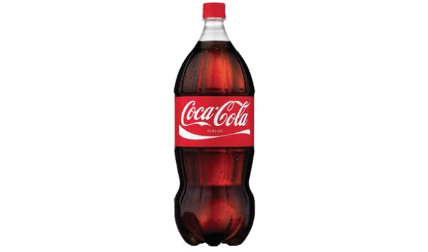
In 2008, Coke redesigned its two-liter bottle to make it curvier and thus, 'easier to hold and pour,' in the words of a Coca-Cola representative. And suddenly, Beilock reports, Coke was selling a lot more of its two-liter sodas than archrival Pepsi.
Does this mean Coke knew all about the way the body influences the mind? Beilock says: ‘My guess is [in tests] people preferred that bottle.’ Based on her research, she believes that the enticing shape of a soda bottle ‘might push you to buy it even knowing it's not the right decision.’
.


.


Any source of Uneeda Biscuits story? I need it so much :))
ReplyDeleteSee: Irving Fang, Alphabet to Internet: Media in Our Lives, Routledge, Nov 13, 2014, p.338
ReplyDelete