
One of the most important communication tools easily picked out by the human eye is color. The Optical Society of America classifies a range of between 7.5 and 10 million hues, which the normal human eye can theoretically distinguish (Eco, 1985). At the same time, the Dictionary of Color (Maerz & Paul, 1953) lists just over 3000 English color names. Gage (1995) suggested that as a result of our inability to call so many colors by name, the modern color systems have resorted to numbers in order to distinguish perceptible differences of hues and values. For many color is a way to express feelings, for others it affects how they feel, and yet for some others the notion of color is so intertwined with culture and religion that color itself takes on profound meaning. According to Nassau (1998):
The term ‘color’ describes at least three subtly different aspects of reality. First, it denotes a property of an object, as in “green grass” . Second, it refers to a characteristic of light rays, as in “grass efficiently reflects green light ... while absorbing light of other colors more or less completely”. And, third, it specifies a class of sensations, as in the brain’s interpretation of the eye’s detection of sunlight selectively reflected from grass results in the perception of green ”Some contend that the light waves themselves may interact with neural activity causing the manifestation of certain behaviors. Color is a powerful element in graphic design as it can change an observer’s mood and helps to convey messages without words. Advertisers and designers are well aware that consumers are not guided entirely by logic in making purchases, and are driven by less identifiable factors such as emotions. Graphic design, like any other form of art, reflects society and its color usage, which is tied to how its targeted audience interprets meaning.
The ancient Egyptians have been recorded to have been using color for cures and ailments.They worshiped the sun, knowing that without light there can be no life. They looked at nature and copied it in many aspects of their lives. The floors of their temples were often green - as the grass which then grew alongside their river, the Nile. Blue was a very important color to the Egyptians too; the color of the sky. There are lists on papyrus dating back to 1550 BC of color "cures". The Chinese also apparently practiced Color Healing. The Nei/ching, 2000 years old, records color diagnoses.
The Greeks considered color only as a science. Hippocrates, amongst others, abandoned the metaphysical side of color, concentrating only on the scientific aspect. Some of the early studies and theories about light were done by Aristotle, who discovered that by mixing two colors a different one can be produced. He did this with a yellow and blue piece of glass, which when brought together produced green. He also discovered that light travels in waves. Plato and Pythagoras also studied light and its impact on colours.
The German poet Goethe and the philosopher Schopenhauer wrote on the subject but it is from the work of the chemist Robert Boyle that we know red, yellow and blue to be the primary colors. Earlier, Michelangelo tried to identify them, but included green in his results.
 |
| 1611, Aron Sigfrid Forsius's Color Wheel
Aron Sigfrid Forsius was a Finnish astronomer, priest and NeoPlatonist. In a previously undiscovered text, he set out a system of color that included his diagrams. One diagram presents a color sphere that arranges colors by opposing pairs: red and blue, yellow and green, and white and black. His diagrams date from 1611 but lay undiscovered in the Royal Library in Stockholm until until the 20th century; they were unearthed and presented before the first congress of the International Color Association in 1969. He wrote:
|
 |
| 1672, Newton's Colour Wheel
Isaac Newton (1642-1726) could be credited with the first model of perceptual color space, essentially a color wheel with white in the center. In the late 1660s, he starts experimenting with his ’celebrated phenomenon of colors.’ At the time, people thought that color was a mixture of light and darkness, and that prisms colored light. Hooke was a proponent of this theory of color, and had a scale that went from brilliant red, which was pure white light with the least amount of darkness added, to dull blue, the last step before black, which was the complete extinction of light by darkness. Newton realizes this theory was false. Light enters the prism from the top right, and is refracted by the glass. The violet is bent more than the yellow and red, so the colors separate. Newton set up a prism near his window, and projected a beautiful spectrum 22 feet onto the far wall. Further, to prove that the prism was not coloring the light, he refracted the light back together.
|
 |
| 1686 Richard Waller's Colour Chart,
Waller’s intention was to make a plain standard of color nomenclature for descriptive use in natural philosophy. This is the first color illustration to be found in the Royal Society’s Philosophical Transactions. It is a hand-finished pigment spot chart based upon the work of Richard Waller FRS (c.1660-1715) whose 1686 paper ‘A catalog of simple and mixt colours with a proper specimen of each…’ contained the prototype pantones. Waller’s original, presented to the Royal Society, no longer exists: sadly it was painted on glass…
|
 |
| 1708 Claude Boutet, Color Wheel
Artists were fascinated by Newton’s clear demonstration that light alone was responsible for color. His most useful idea for artists was his conceptual arrangement of colors around the circumference of a circle, which allowed the painters’ primaries (red, yellow, blue) to be arranged opposite their complementary colors (e.g. red opposite green), as a way of denoting that each complementary would enhance the other’s effect through optical contrast. This circular diagram became the model for many color systems of the 18th and 19th centuries. Claude Boutet’s painter’s circle of 1708 was probably the first to be based on Newton’s circle. Unable to represent spectral red with any pigment, Boutet substituted two reds – fire-red and crimson – omitting one of Newton’s two blues. To compound the confusion, the colorist evidently misread two of the labels, “orange” and “violet.”
|
 |
| 1741, Gautier, color-printed picture
Gautier's color-printed picture accompanied one of his many anti-Newtonian publications about color theories. The band of color at the center imitates an illustration in Newton's Optics but "proves" Gautier's assertion that all colors cannot be found in Newton's spectrum of light.
|
 |
| J. Heinrich
Lambert, strongly influenced by the work of Tobias Mayer, presented the
first three-dimensional colour-system in 1772.
German astronomer and mathematician, Tobias Mayer, gave a lecture in 1758, in which he attempted to identify the exact number of colors the eye could perceive. He stated that there were 12 gradations between each color, having chosen red, yellow and blue as his primary colors (vermillion, massicot and azurite among pigments), with white and black only involved in lightening or darkening colors. They weren’t colors themselves, but “agents” of light and darkness. He believed that different colors only became visible to the eye when 1/12 of a color was mixed with a primary, so red plus 1/12 yellow would yield a new visible color to the eye. No new color would be visible until you got to red plus 2/12 yellow. In Mayer’s system r12 (12 units of red)=red, r6y6=orange, b6y6=green, b6r6=violet, etc. In his system, there were 91 colors created by these formulas. In 1775, Mayer’s color triangle was published.
|
 |
| 1810, Goethe’s color wheel
Goethe did two experiments to prove his theory that color resulted from the interplay of light and darkness. His observations with a prism showed him that light did not split into seven continuous rainbow hues but that the beam had a red edge, turning to yellow, which became white in the middle until it passed into green shades that darkened to blue along its other edge.
His Theory of Colors, published in 1810 made note of phenomena such as colored shadows, refraction, and chromatic aberration. Goethe did not see darkness as the absence of light, but as a polar opposite that interacts with it, causing the sensation of color. Modern natural science sees darkness as a complete nothingness. According to this view, the light which streams into a dark space has no resistance from the darkness to overcome. Goethe pictures to himself that light and darkness relate to each other like the north and south pole of a magnet. The darkness can weaken the light in its working power. Conversely, the light can limit the energy of the darkness. In both cases color arises. Yellow is a light which has been dampened by darkness; Blue is a darkness weakened by the light.Newton’s color wheel contained the seven colors of the rainbow that he observed. Goethe proposed a 6-colour symmetric wheel where the colors were diametrically opposed to each other, as they “reciprocally evoke each other in the eye. Thus, yellow demands violet; orange, blue; red, green; and vice versa: thus… all intermediate gradations reciprocally evoke each other; the simpler color demanding the compound, and vice versa.” (Goethe, Theory of Colors, 1810) This opened the way to color wheels with harmonious and complementary relationships. |
 |
| 1839, Philipp Otto's Color Wheels for Artsts
Around the same time as Goethe, Phillip Otto Runge, a German painter and draughtsman, developed his model of 3-dimensional color spheres. Runge was interested in color relationships and felt that artists had been abandoned by scientists because scientists seemed to be solely interested in the properties of color that related to refracted light. His spheres arranged colors by hue and also included black and white, introducing tones, shades and tints into his color system.
|
 |
| 1839, Chevreul’s colour wheel
Michel Eugène Chevreul was a trained chemist who became involved with the process of dyeing when he was appointed as the director of carpet manufacturer, Gobelin. He noted that the colors of the dyes often did not have the effect desired and that this was due to optics and not chemistry. In 1839 he produced his seminal work, De la loi du contrast simultané des couleurs, to provide provide a systematic way to see colors, where he dealt with the “simultaneous contrast” of colors. His work underlined the active role the brain has in the perception of color. He showed that a color will give the color next to it a complementary tint, so that yellow next to green will receive a violet tint. This is where he stated that:
|
 |
| Chevreul developed a 72-segment color wheel where there are 12 main colours in each segment, further dividing into 6 zones. Each colour is divided into 20 sections to indicate the levels of brightness. He designed a 3-dimensional colour circle (right) that showed the 20 levels of brightness on the flat plane – in the drawing you can see the orange moving toward white. However, rising from the center is a line representing black and it forms an axis with the color that is broken into 10 segments showing the color becoming darker. The numbering system indicates that 0N (N for “nero” or black) is the pure color and it moves toward black in increasing increments of “N” until 9N is almost black (9 parts black with 1 part color) and 10N would be black. |
The work of Chevreul, is of particular importance as he experimented with the affects of placing different colors alongside one another. He examined the optical effect which is now used in color printing and color television. It was Chevreul whose experiments formed the scientific basis for the work of impressionist painters such as Monet, Renoir and Van Gogh.
Through Chevruel's research and our own experiences, we know that colors are not static. Colors are similar to people--their personalities change and they can be influenced by close associations. -- Joen Wolfrom in "The Magic Effects of Color."
 |
| 1905, Albert Munsell's 3-D Colour Wheel |
While attending the Boston Normal Art School in the late 19th century, Albert Munsell was keenly aware that a practical theory of color did not exist. From his own work and experiments, he developed the Munsell Color System. Using his system made it possible to discuss color scientifically. He defined color in terms of Hue, Value and Chroma. Hue was defined as the actual color, red, blue, green, etc. Value was defined as how light or dark a color is. Chroma was defined as how strong or weak a color is. He published a standard color atlas defining the Munsell Color Standard which, before his work, had been an impossible task.
His work was embraced by the scientific community. In 1914 he was invited to present his findings to the scientific communities of England, France and Germany. His theory is still taught today.
His work was embraced by the scientific community. In 1914 he was invited to present his findings to the scientific communities of England, France and Germany. His theory is still taught today.

In the 20th century the Swiss artist Johannes Itten, who worked and taught at the Bauhaus School of Art in Germany, continued Chevreul's analysis and established the rules of color theory as they are now taught in art and design schools throughout the world. Itten is attributed with being the first person to associate colors with four types of people. However, the best known of Itten's work is probably the twelve point color wheel which is in wide use today on paint charts for home decorators, in dyeing kits and in hairdressers' color charts. Itten would have approved of this development as he sought to establish an objective approach to support our intuitive sense of color. He likened his rules to those governing music, in particular, the analogy between his seven different types of color and the musicians' scales and rules of musical harmony.
 |
1921, Johannes Itten' Color Wheel
Johannes Itten was a Swiss painter, textile designer, teacher, writer and theorist, and a contemporary of Paul Klee and Wassily Kandinsky. He studied under Adolf Hölzel, a German artist and painter, before joining the Bauhaus in 1919. Among Itten’s many contributions as a color theorist is his consideration of the psychological characterstics of colors; he felt that characteristics of a color could influence how a person feels when they perceive that colour. He believed that people didn’t need training to find their own “subjective colors.” One of his major contributions was on the color wheel. This 12-colour wheel is his expansion of Hölzel’s color wheel and it uses red, yellow and blue as its primary colors. There are also 3 secondary colors (mixing the 3 primary) of green, orange, and violet and 6 tertiary colours (mixing a primary with a secondary color), which are red-orange, yellow-orange, yellow-green, blue-green, blue-violet and red-violet. Primary colors are positioned equidistant from one another and are connected by a bridge using secondary and tertiary colors primary color wheel.
|
Color Harmonies
 |
| Complementary color scheme Colors that are opposite each other on the color wheel are considered to be complementary colors (example: red and green). The high contrast of complementary colors creates a vibrant look especially when used at full saturation. This color scheme must be managed well so it is not jarring. Complementary color schemes are tricky to use in large doses, but work well when you want something to stand out. Complementary colors are really bad for text  |
 |
| Analogous color scheme Analogous color schemes use colors that are next to each other on the color wheel. They usually match well and create serene and comfortable designs. Analogous color schemes are often found in nature and are harmonious and pleasing to the eye. Make sure you have enough contrast when choosing an analogous color scheme. Choose one color to dominate, a second to support. The third color is used (along with black, white or gray) as an accent.  |
 |
| Triadic color scheme A triadic color scheme uses colors that are evenly spaced around the color wheel. Triadic color schemes tend to be quite vibrant, even if you use pale or unsaturated versions of your hues. To use a triadic harmony successfully, the colors should be carefully balanced - let one color dominate and use the two others for accent.  |
 |
| Split-Complementary color scheme The split-complementary color scheme is a variation of the complementary color scheme. In addition to the base color, it uses the two colors adjacent to its complement. This color scheme has the same strong visual contrast as the complementary color scheme, but has less tension. The split-complimentary color scheme is often a good choice for beginners, because it is difficult to mess up./td>  |
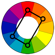 |
| Rectangle (tetradic) color scheme The rectangle or tetradic color scheme uses four colors arranged into two complementary pairs. This rich color scheme offers plenty of possibilities for variation. Tetradic color schemes works best if you let one color be dominant. You should also pay attention to the balance between warm and cool colors in your design.  |
 |
| Square color scheme The square color scheme is similar to the rectangle, but with all four colors spaced evenly around the color circle. Square color schemes works best if you let one color be dominant. You should also pay attention to the balance between warm and cool colors in your design.  |
Psychological Effects of Color on Viewers
 |
| The popular, applied, and scientific literature are replete with statements regarding the content of color associations. For any given color, these associations are multifarious and, at times, contradictory, making clear conclusions about color associations and their implications elusive. Research suggests that clarity on this issue may be gained by taking context into consideration. It is likely that color carries different meanings in different contexts and, therefore, that color has different implications for feelings, thoughts, and behaviors in different contexts.( Elliot et al, 2007) |
Color is ubiquitously present in our visual experience of the world. It is thus not surprising that over the past century or so various scientific properties of colour have been studied intensively, yet the psychological impacts of colour have not yet fully explored (Wright, 1998), We know very little about the effect of color on moods, behaviour, and thinking (Fehrman & Fehrman, 2004; Whitfield Wiltshire, 1990). Some authors claim that people make up their minds within 90 seconds of their initial interactions with either people or products, and about 62-90 percent of the assessment is based on colors alone. Although, one may question the validity of such generalized type of claims, which are not factoring elements like income, culture, age as well as; other pertinent factors, nevertheless, it is reasonable to believe that tasteful use of colors in a balanced design can be an advantage for differentiating products in the minds of certain types of consumers with finer tastes. Colour also impact moods and feelings towards certain products, you may prefer your milk in a white container, because of concerns about cleanliness and its association with health. But if you suggest to a Persian (as the above Chart suggest) that:
Yellow shines with optimism, enlightenment, and happiness. Shades of golden yellow carry the promise of a positive future. Yellow will advance from surrounding colors and instill optimism and energy, as well as spark creative thoughtsShe may look at you in total disbelief, since for more than six millennium, yellow in her culture has been a symbolical representation of weakness and malaise. In fact, at the start of every new year, Persians jump over small bonfires wishing "the vigor of your redness to me, the yellowness of my malaise to you".
In France "La rose jaune représente le mensonge, la trahison, pour se faire pardonner une infidélité"In font of traffic lights a green signal means you can go but the yellow light warns you of danger, and tells you to stop! In fact, a growing body of empirical research indicates that the diversity of cultural and personal experiences are the main determinants of attitudes and feelings towards various colours. According to these studies consumers try to improve facets of their self - image by purchasing and using commercial brands that offer them such a possibility of improvement . Furthermore, research on self - image congruence suggests :
Because negative stereotypical images appear to feed into purchase-related decision processes at early stages, due caution should be exerted in primary data collection and brand positioning. Primary data collection should capture both positive and negative brand-related meanings attributed by consumers. Because the results show that undesired congruity has an incremental explanatory effect, positive versus negative symbolic meanings are clearly not just “two sides of the same coin”. Consequently, brand positioning should define its strategy by simultaneously maximizing both the closeness to desired symbolic meanings and the distance to undesired symbolic associations (Bosnjak and Brand, 2008).Some have argued that certain colors convey the idea or feeling of luxury. However, as Cornell (2002) argues:
'Luxury is particularly slippery to define. A strong element of human involvement, very limited supply and the recognition of value by others are key components ... So between premium and luxury, in marketing terms, is a difference of degree.'In other words, it is positive symbolic meaning and the recognition of value by others that determines what is luxury or what is an undesirable product, and color may play a minor role in this framework. Moreover, as Vigneron and Johnson, (2004) argue the perception of what is and is not a luxury brand, as well as the amount of luxury contained in a brand, may be dependent on the context and the people concerned.
In fact, there are no universal link from a particular color to a specific emotional impact. Nevertheless, Woodson, Tillman, et al. (1992) have argued that
Although color researchers have not always been able to quantify the precise effects of various colors or light levels on humans, their research and experience seem to indicate that certain colors and light conditions often elicit typical repeatable reactions”Thus, the relationship between brands and color may be related to both typical repeatable reactions and on the perceived appropriateness of the color being used for the particular brand by a culture. According to some studies it’s far more important for a brand’s colors to support the image that a designer wants to portray instead of trying to align with stereotypical color associations. Furthermore, researchers have found that predicting consumer reaction to color appropriateness in relation to the product is far more important than the individual color itself, and that there is a real connection between the use of colors and customers’ perceptions of a brand’s personality.

Color and Moods
Some empirical studies claim that shopping environments can evoke mood responses in consumers (Machleit and Eroglu, 2000) and that these moods, in turn, impact shoppers behaviours and their buying patterns (Donovan and Rossiter 1982, Darden and Babin 1994, Sherman, Mathur and Smith 1997). Studies on environmental psychology suggest that shoppers have one of two responses to an atmosphere: (i) approach, (ii) avoidance (Turley & Milliman, 2000). Approach and avoidance behaviors can create four different sets of outcomes: (1) a desire to stay or leave; (2) a desire to explore and interact or a tendency to want to leave and not explore the store; (3) a desire to communicate with others or to ignore them; and (4) feelings of satisfaction or dissatisfaction (Hoffman & Turley, 2002). Hoffman and Turley (2002) recognized color as one of four atmospherics of any facility. Some studies claim store-interior color influences feelings, store and merchandise image, simulated purchases, purchasing rates, time spent in the store and retail display attraction (Bellizzi, Crowley and Hasty 1983, Bellizzi and Hite 1992, Crowley 1993), it is still unclear which emotions can be evoked by colors in the store interior. Indeed, the color stimuli used in previous studies did not represent a broad-based and balanced sample of color stimuli.
Color and Performance
Many researches try to explore the impact of color on performance, attitude and productivity of workers, students or athletes. According to some psychologists, our physiological reactions to color are part of the unconscious that contains memories and ideas inherited from our ancestors over the course of evolution. in other words they are biologically inherited from the cumulative experiences of our species with our environments. Kurt Goldstein (1942) observed that patients with Parkinson’s disease and other organic diseases of the central nervous system responded in a different way when they were exposed to green or red colors. He noticed that the red color had a tendency to worsen his patients’ pathological condition and green seemed to improve it. Based on his experiments and observations with a very small sample (3-5) of these brain-damaged individuals, Goldstein attempted to develop a theory that could be applied for all people. Thus, theorized that red (and yellow) relative to green (and blue) would impair performance on activities in which exactness is required . Several researchers, however, criticized the study noting that Goldstein’s sample was too small, the color stimuli were inconsistently placed on pieces of colored paper, colored walls, or colored clothing, and the observations were never accompanied with any meaningful statistical analysis (Nakshian, 1964). Beach, Wise, and Wise (1988) noted that:
“Goldstein’s theory was based on the notion that there existed a one to one mapping between color states and emotional states, which seems to be a gross oversimplification of the complex processes linking color and behavior”Color as stimulant
In 1908, psychologists Robert Yerkes and John Dillingham Dodson discovered that mild electrical shocks could be used to motivate rats to complete a maze, but when the electrical shocks became too strong, the rats would scurry around in random directions to escape. The experiment demonstrated that increasing stress and arousal levels could help focus motivation and attention on the task at hand, but only up to a certain point, They summarized their findings in a formulation known as Yerkes-Dodson Law, which suggests that there is a relationship between performance and arousal. Increased arousal can help improve performance, but only up to a certain point. At the point when arousal becomes excessive, performance diminishes. Extending the law to the field of colors, some researchers viewed longer wavelength colors (red, orange) as arousing, whereas shorter wavelength colors (green, blue) as calming, and thus inferred that longer wavelength colors, relative to shorter wavelength colors, impair performance on complex tasks.
Soldat, Sinclair, and Mark (1997; see also Sinclair, Soldat, and Mark,1998) presented reason in tasks from the Graduate Record Examination on colored paper and observed that an upbeat red fostered heuristic processing, whereas a depressing blue fostered systematic processing. Hill and Barton(2005) on the other hand have argued that red coloration is a sexually selected, testosterone-dependent signal of male quality in a variety of animals, and in some non-human species a male's dominance can be experimentally increased by attaching artificial red stimuli. They claim that a similar effect can influence the outcome of physical contests in humans — across a range of sports, they also claim to have that wearing red is consistently associated with a higher probability of winning, and the results indicate not only that sexual selection may have influenced the evolution of human response to colors, but also that the color of sportswear needs to be taken into account to ensure a level playing field in sport.
In three studies on the effect of color of environment at four homogeneous elementary schools in Wetaskiwin, Alberta, Canada during the 1982-1983 academic school year, Wohlfarth found a significant trend in reduction of the average reported incidence of aggressive and destructive behavior in warm light yellow and a warm light blue painted classrooms. Rosenstein,' in a study of the effect of color on performance, found significant effects on mood. Fabrics in four colors, medium blue, bright red, bright yellow, and neutral (burlap), were used to line the rooms in which subjects took the Scholastic Aptitude Test (SAT). AJI of the studied groups but one, reported themselves to be calm and in good moods while in the blue room. While in the red room, all of the groups but one, reported themselves to be in better moods than when in the yellow and neutral rooms.
Several studies have been conducted on the effects of environmental color on productivity and mood in the workplace. Kwallek and Lewis investigated the effects of bright red, bright green, and white painted walls in otherwise identical offices on production and mood of workers. Subjects in the white office made more errors on a clerical test than subjects in the red office. Kwallek and Lewis also found that the subjects working in the bright red office had significantly lower confusion-bewilderment post-test scores when compared with those working in the bright green office.
To find evidence of change in emotional states due to color, Jacobs and Blandino asked 110 men and 121 women undergraduates to evaluate their moods by completing the Profile of Mood States. The same test was given to all subjects, however, subjects were told that different tests were on different colored paper; blue, green, canary, and red, and that the study was designed to assess the consistency of forms used in psychological testing. Control forms were printed on white paper. Forms were randomly distributed to students. The results showed that the red and green colors significantly affected fatigue states, with green resulting in highest fatigue scores and red resulting in lowest fatigue scores.
Conflicting Results
As Bakker et al. (2013) argue much color research analysing the influences of colour on human beings is being conducted in an artificial setting by employing students performing artificial tasks, using different test materials and measuring different effects by using questionnaires . The results are often conflicting.
They offer the following reasons for the conflicting results.
- Laboratory situations are a reduction of the complex physical and social con- texts of real-life situations. The use of laboratory facilities is often criticized, because the effects of color are highly dependent on its context. The effects of colors are for instance dependent on physical context variables such as daylight, space dimensions and textures, and on social context variables, i.e. social interactions are different in a natural environment compared with a laboratory situation.
- Most color research is conducted with subjects who are students. Color testing with students’ results in selection bias as students are not representative for the overall population. The intrinsic motivation of students often differs from subjects in a real-life situation. For example employees are motivated by social and organizational dependencies, whereas students are more interested in having fun
- It is difficult to compare artificial tasks with real-life task performances, where social inter-dependencies and organizational responsibilities are involved.
- In the laboratory settings different colored test materials are used such as virtual coloring with screens; clothing, slides, color samples like pegs and color pictures. Materials and devices with different characteristics may influence color research results.
In 2004, Hancock and Szalma wondered how we can verify the empirical evidence (Hancock and Szalma 2004 ). Next to quantitative methods, in addition, qualitative methods have limitations due to, among other things, attitudes of the subjects. Research concerning the application of questionnaires as an appropriate means to analyze the truth indicates that questionnaire findings may have limited validity, e.g. due to a lack of interest of respondents, the fact that respondents not always tell the truth and the unwillingness of respondents to admit certain attitudes or behaviour. In summary, the main drawback of current studies on the influence of color is that most studies are conducted in an artificial setting using questionnaires as a main method to measure effects.
References
- Aaker Jennifer L., (1997) Dimensions of Brand Personality, Journal of Marketing Research Vol. 34, No. 3 , August, pp. 347-356
- Alpert, J.I. and Alpert, M.I. (1986), The Effects of Music in Advertising on Mood and Purchase Intentions, University of Texas, Austin, TX.
- Beach, L., B.K. Wise, and J.A. Wise. (1988). The Human Factors of Colour in Environmental Design: A Critical Review . Moffe Field, CA: National Aeronautics and Space Administration, Ames Research, in Tofle, R.B., B. Schwartz, S. Yoon, A. Max-Royale. 2004. Colour in Health- care Environments: A Critical Review of the Research Literature . United States of America: The Coalition for Health Environments Research (CHER).
- Bakker Iris, Theo van der Voordt , Peter Vink & Jan de Boon (2013), The use of questionnaires in colour research in real-life settings: in search of validity and methodological pitfalls, Theoretical Issues in Ergonomics Science,
- Bellizzi, J.A., Crowley, A.E. and Hasty, R.W. (1983), “The effects of color in store design”,Journal of Retailing, Vol. 59 No. 1, pp. 21-45.
- Bellizzi, J A and Hite, R E, (1992), Environmental Color, Consumer Feelings, and Purchase Likelihood, Journal of Psychology and Marketing, Vol.9, Issue 5, pp 347-63.
- Birren, Faber.(1961), Color Psychology and Color Therapy, New Hyde Park, New York: University Books, Inc.,
- Bottomley Paul A. John R. Doyle, (2006)The interactive effects of colors and products on perceptions of brand logo appropriateness, Marketing Theory March, vol. 6 no. 1 63-83,
- Bosnjak Michael and Nina Rudolph, (2008), Undesired self-image congruence in a low-involvement product context ., European Journal of Marketing, Vol. 42 Iss: 5/6, pp.702 - 712
- Cimbalo, R.S., Beck, K.L. and Sendziak, D.S. (1978), “Emotionally toned pictures and color selection for children and college students”, Journal of Genetic Psychology, Vol. 33 No. 2, pp. 303-4.
- Cornell, A. (2002) 'Cult of luxury: The new opiate of the masses', Australian Financial Review, 27th April, p. 47.
- Crowley A.E., (1993). “The Two Dimensional Impact of Color on Shopping”, Marketing Letters, 4, p59-69.
- Darden, W. R., and Babin, B. J., (1994). Exploring the Concept of Affective Quality: Expanding the Concept of Retail Personality. Journal of Business Research, vol. 29, February, 101-110.
- Donovan R.J. and Rossiter J.R., 1982. “Store Atmosphere: An Experimental Psychology Approach”, Journal of Retailing 58 (Spring), p34-57.
- Eco, U. (1985). How Culture Conditions the Colours We See. In M. Blonsky (Ed.) On Signs . Baltimore, MD: The Johns Hopkins University Press.
- Elliot, Andrew J., Maier, Markus A., Moller, Arlen C., Friedman, Ron, and Meinhardt, Jörg, (2007), Journal of Experimental Psychology, Vol 136(1), Feb, pp. 154-168
- Fehrman, K. R., and Fehrman, C. (2004). Color: The secret influence (2nd ed.). Upper Saddle River, NJ: Prentice Hall.
- Fernández-Vázquez Rocío, Carla M Stinco, Antonio J Meléndez-Martínez, Francisco J Heredia, and Isabel M Vicario (2011), Visual and Instrumental Evaluation of Orange Juice Color: A Consumers' Preference Study,Journal of Sensory Studies Volume 26, Issue 6, pages 436–444, December
- Gage, J. (1995). Color and Culture. In T. Lamb, and J. Bourriau (eds.), Colour: Art & Science . New York, NY: Cambridge University Press.
- Gerard, R.M. (1957), “Differential effects of colored lights on psychophysiological functions”, unpublished doctoral dissertation, University of California, Los Angeles, CA.
- Hatta, T., Yoshida, H., Kawakami, A., and Okamoto, M. ( 2002). Color of computer display frame in work performance, mood, and physiological response. Perceptual and Motor Skills, 94, 39– 46.
- Hill, R. A., & Barton, R. A. ( 2005, May19). Red enhances human performance in contests. Nature, 435, 293.
- Hoffman, K D and Turley L.W, (2002), Atmospherics, Service Encounters and Consumer Decision Making: An Integrative Perspective, Journal of Marketing Theory and Practice, Issue. Summer, pp 33-46.
- Isaacs, L. D. ( 1980). Effects of ball size, ball color, and preferred color on catching by young children. Perceptual and Motor Skills, 51, 583– 586.
- Jacobs, K.W. and Suess, J.F. (1975), “Effects of four psychological primary colors on anxiety state”, Perceptual and Motor Skills, Vol. 41, pp. 207-10
- K. W. Jacobs and S. E. Blandino, (1992), Effects of Color of Paper on Which the Profile of Mood States is Printed on the Psychological States in Measures, Perceptual and Motor Skills 75 , pp. 267-271.
- Kaiser, P., (1984), Physiological response to color, Color Research and Application, Vol. 9 No. 1, pp. 29-36.
- Kemp, S. (1998) 'Perceiving luxury and necessity', Journal of Economic Psychology, Vol. 19, October, pp. 591-606.
- Kopacz Jeanne,(2004), Color in Three Dimensional Design, McGraw Hill
- Kopec Dak, (2005), Environmental Psychology for Designers, Fairchild Books, a division of Fairchild Publications, Inc., New York NY
- Kotler, P. (1973), “Atmospherics as a marketing tool”,Journal of Retailing, Vol. 49 No. 4, pp. 48-61
- N. Kwallek & c. M. Lewis, (1990), Effects of Environmental Colour on Males and Females: A Red or White or Green Office. Applied Ergonomics, 21,4 . pp. 275-278.
- Labrecque, Lauren I. George R. Milne, (2012), Exciting red and competent blue: the importance of color in marketing Journal of the Academy of Marketing Science, September, Volume 40, Issue 5, pp 711-727
- Machleit, K. A., & Eroglu, S. A., (2000). Describing and Measuring Emotional Response to Shopping Experience. Journal of Business Research, vol. 49, 101-111.
- Maerz, A. and Paul, R. (1953). A Dictionary of Color . New York: Crowell.
- Michel Lou, (1996), Light: The Shape of Space, Designing with Space and Light, John Wiley and Sons, Inc.
- Nakshian, J. S. (1964). The Effect of Red and Green Surroundings on Behavior. Journal of General Psychology , vol. 70, 1964, pp. 143-161.
- Nassau, K. (Ed.) (1998). Color for science, art and technology . Amsterdam, The Netherlands: Elsevier.
- Pressey, S. L. ( 1921). The influence of color upon mental and motor efficiency. American Journal of Psychology, 32, 327– 356.
- Rosenstein, L. D. ( 1985). Effect of color of the environment on task performance and mood of males and females with high or low scores on the Scholastic Aptitude Test. Perceptual and Motor Skills, 60, 550.
- Sherman, E., Mathur, A., & Smith, R. B., (1997). Store Environment and Consumer Purchase Behavior: Mediating Role of Consumer Emotions. Psychology & Marketing, vol. 14, n° 4, 361-378.
- Sinclair, R. C., Soldat, A. S., & Mark, M. M. ( 1998). Affective cues and processing strategy: Color-coded examination forms influence performance. Teaching of Psychology, 25, 130– 132
- Soldat, A. S., Sinclair, R. C., & Mark, M. M. ( 1997). Color as an environmental processing cue: External affective cues can directly affect processing strategy without affecting mood. Social Cognition, 15, 55– 71.
- Stone, N. J. and English, A. J., (1998). Task Type, Posters, and Workspace Color on Mood, Satisfaction, and Performance. Journal of Environmental Psychology, 18, 2, 175—185.
- Tektronix (1988), The Color Connection, Catharine & Sons, Morton, IL
- Turley, L. W., and Milliman, R. E. (2000). Atmospheric effect on shopping behavior: A review of the experimental evidence. Journal of Business Research, 49(2), 193.
- Vigneron, F. & Johnson, L.W. (2004) Measuring perceptions of brand luxury. Journal of Brand Management , 11(6), 484 - 506.
- Wiegersma, S. and Van der Elst, G. (1988), “Blue phenomenon: spontaneity or preference?”, Perceptual & Motor Skills, Vol. 66 No. 1, pp. 308-10.
- Whitfield TW1, Wiltshire TJ. (1990), Color psychology: a critical review. Genet Soc Gen Psychol Monogr. Nov;116(4):385-411.
- Whitfield, T. W., & Wiltshire, T. J. (1990). Color psychology: A critical review. Genetic, Social and General Psychology Monographs, 116, 387–412.
- Wohlfarth H., (1985), The Lack of Effect of Color Psychodynamic Environmental Modificationon Academic Achievement and I.Q. Scores in Elementary Grade Students, The journal for Bio social Research, 7, 2 ,pp.49-54
- Woodson, W., Tillman, B., and Tillman, P. (1992). Human Factors Design Handbook . New York.: McGraw-Hill, Inc.
- Wright, A. (1998). The beginner’s guide to color psychology. Singapore: Kyle Cathie.

Thanks for posting..
ReplyDeleteI am cheesing on all of this information.
ReplyDeleteThank you for compiling
:O